Marketing
Jul 16, 2025
Designing for People First with Interfaces That Connect

Visual design is more than just choosing attractive colors or trendy fonts — it’s the foundation of how users interpret and experience a brand. Every choice, from layout spacing to contrast and hierarchy, plays a role in how clearly information is communicated and how emotionally engaging the interface feels.
We’ve introduced a refined visual layout system that helps present complex content with clarity and elegance. Through a combination of bold typography, clean imagery, and subtle animation, each section draws attention without overwhelming the viewer. It’s all about achieving balance — strong visuals that support the message, not distract from it.
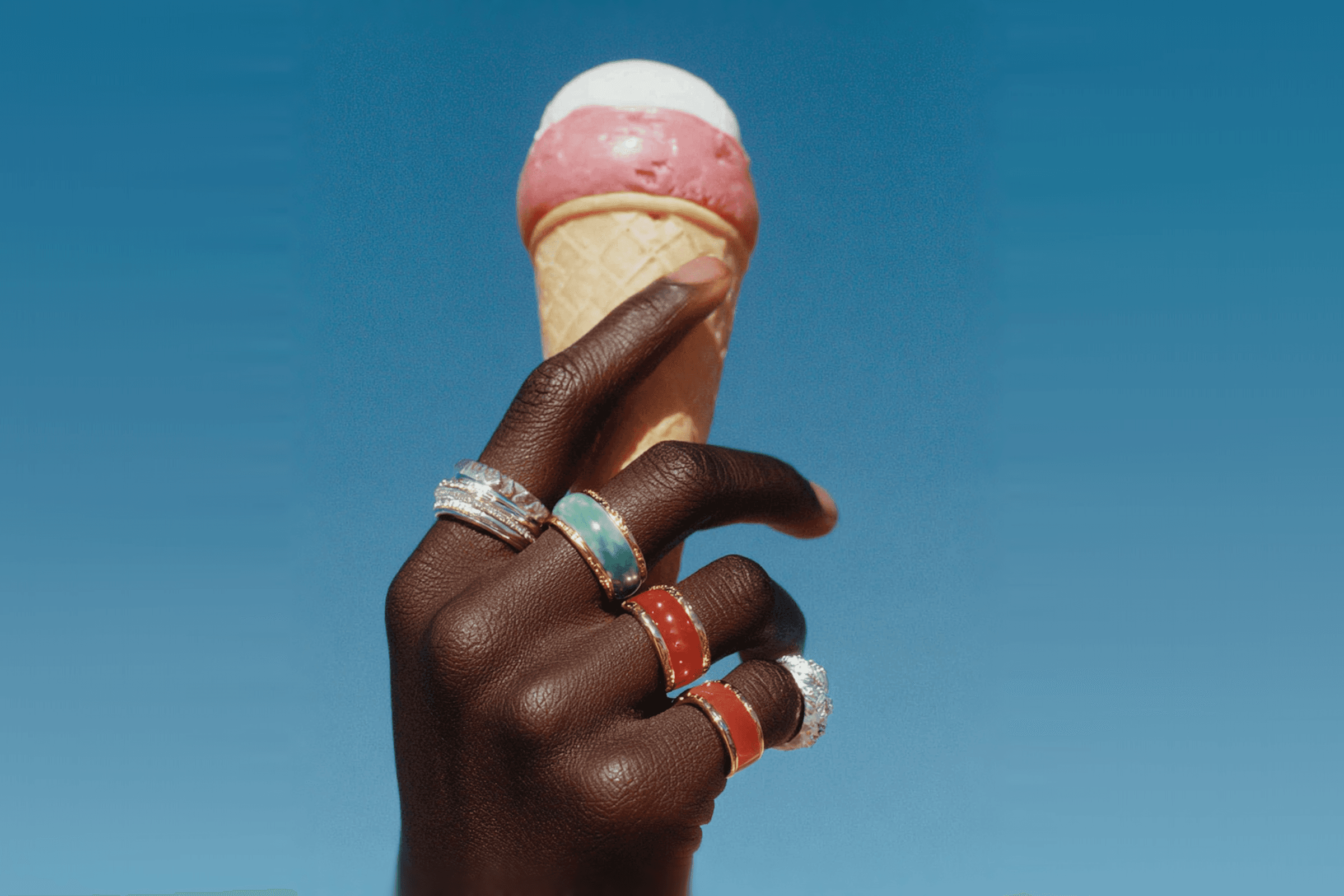
We also created a new hero section that puts visuals at the forefront. By featuring edge-to-edge imagery paired with minimal, purposeful text, it sets a tone of confidence and clarity. Whether used for product launches or brand storytelling, it ensures your message is both immediate and impactful.
We introduced a modular card system, designed to scale across different use cases — from portfolios and case studies to product features. Each card is built with a focus on layout harmony and content readability.
Key improvements include:
Balanced text-to-image ratios for visual clarity
Responsive spacing across breakpoints
A unified rhythm that improves flow and structure
These updates give teams more control over their visual language, helping create consistent, beautiful designs that feel intentional at every level. The result is a system that not only looks polished, but also enhances the user experience by making content easier to engage with and understand.